Personal • Shipped 2026
Designing a focus app that doesn't become another distraction
The Problem
The apps built to improve focus had become distractions themselves
I realised I was spending more time using my focus app than actually focusing.
I was spending more time using my focus app than actually focusing.
What began as simple timers had evolved into products filled with streaks, achievements, analytics, badges, themes, and endless customization. Instead of helping me begin work, they demanded attention before I had even started.
Simple timers had evolved into products filled with streaks, achievements, analytics, badges, themes, and endless customization. Instead of helping me begin, they demanded attention before I had even started.
That raised a simple question:
Can a focus app reduce distractions without becoming another distraction itself?
The Solution
PM'DO: A focus app designed to disappear when work begins
PM'DO rethinks the focus experience by removing unnecessary friction and keeping attention where it belongs: on the work itself.
PM'DO removes unnecessary friction and keeps attention where it belongs: on the work itself.
Instead of maximizing engagement, every interaction is designed to minimize it. The product quietly supports the entire focus journey, from starting a session to staying immersed, without asking users to manage the app itself.
Instead of maximizing engagement, every interaction minimizes it. The product supports the focus journey from starting a session to staying immersed, without asking users to manage the app itself.
Core Experience
Designed around the way focus naturally unfolds
Rather than treating focus as a timer, PM'DO supports the complete journey from starting a session to staying immersed and returning with minimal friction.
Start focusing in seconds
Every extra decision delays meaningful work. PM'DO opens ready to use with sensible defaults, allowing users to start a session with little to no setup.
PM'DO opens ready to use with sensible defaults, so users can start a session with little to no setup.
Stay connected to your surroundings
Instead of isolating users from the outside world, dynamic backgrounds adapt to the time of day and local weather, creating an environment that feels calm, familiar, and grounded.
Dynamic backgrounds adapt to the time of day and local weather, creating a calm, familiar, grounded environment.
Remove everything except the work
Expand Mode strips away secondary controls, leaving only the timer and essential actions. The interface fades into the background so attention stays on the task.
Expand Mode strips away secondary controls, leaving only the timer and essential actions.
Make the experience your own
As routines evolve, PM'DO grows with them through customizable timers, ambient sounds, Focus Lock, and lightweight preferences, without compromising the simplicity of the core experience.
Customizable timers, ambient sounds, Focus Lock, and lightweight preferences adapt to evolving routines without compromising simplicity.
Designed to fade into the background
Every interaction reduces friction, keeping attention on meaningful work.
Research
Looking beyond the timer
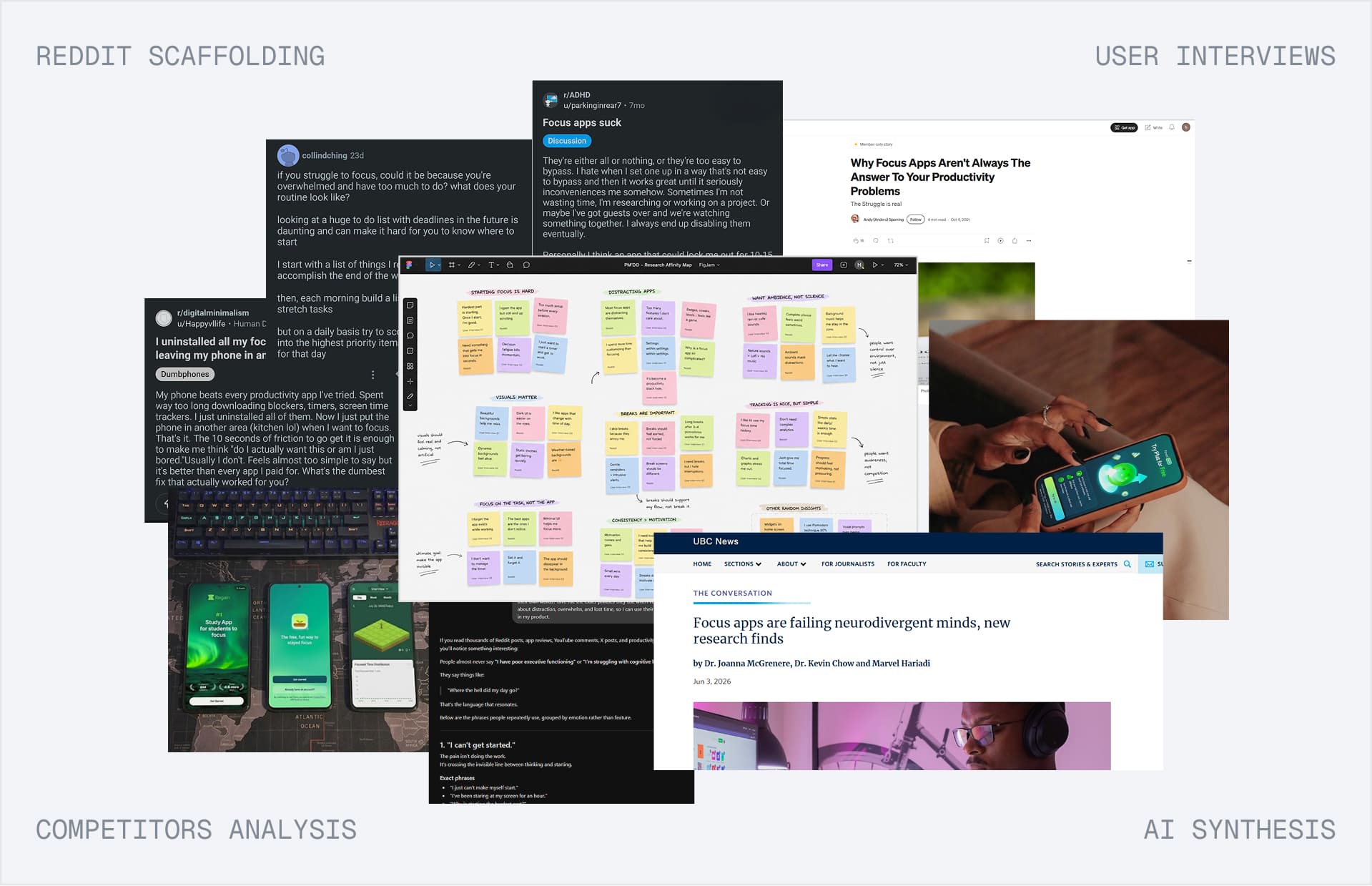
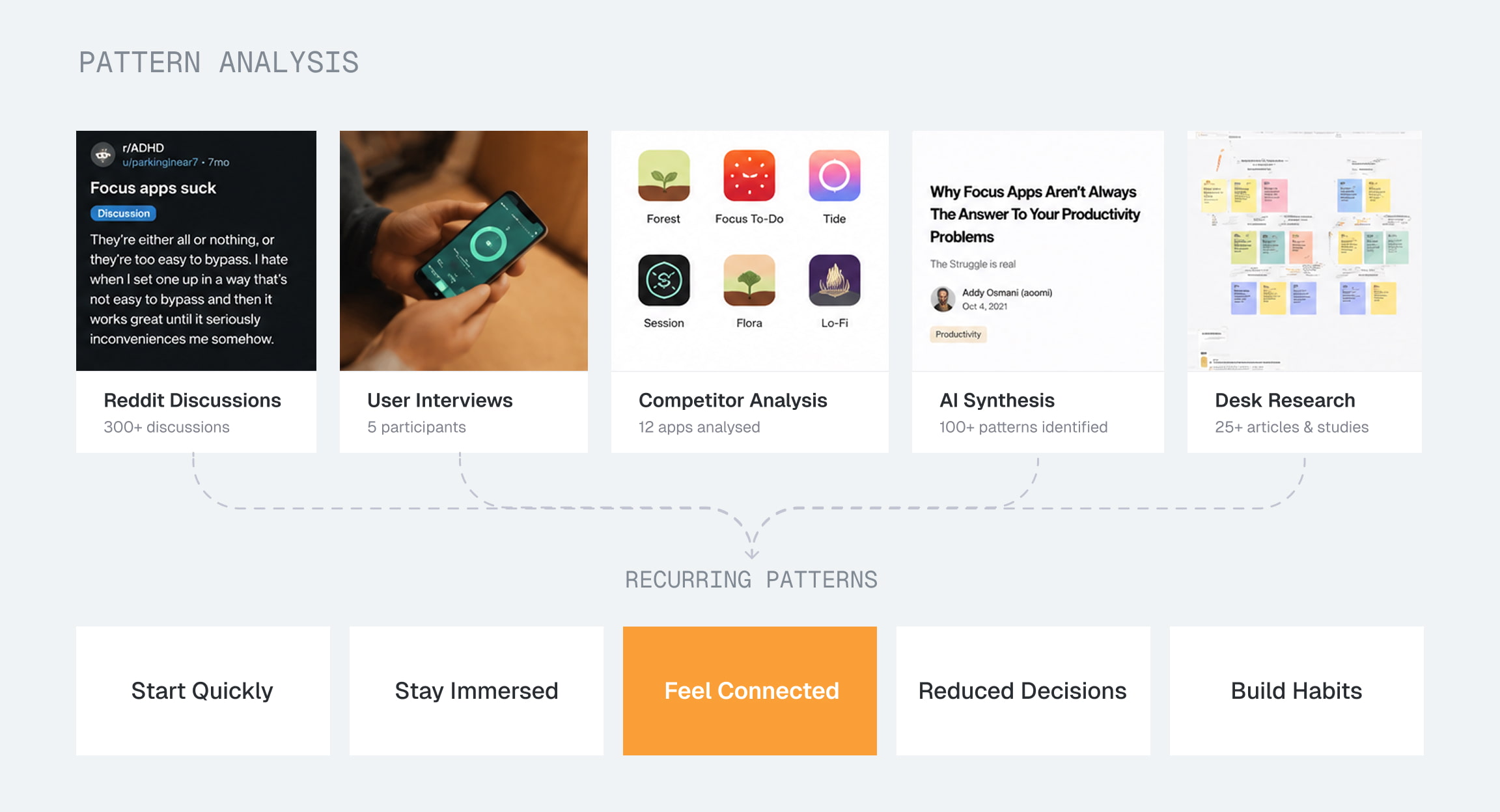
Before designing the interface, I wanted to understand why existing focus tools often failed to keep people engaged in meaningful work. Rather than relying on a single research method, I combined competitor analysis, user interviews, Reddit discussions, personal journaling, and AI-assisted synthesis to uncover recurring patterns across different perspectives.
Before designing the interface, I combined competitor analysis, user interviews, Reddit discussions, personal journaling, and AI-assisted synthesis to understand why existing focus tools failed to support meaningful work.
Instead of looking for features to replicate, I looked for the behaviors, frustrations, and motivations shaping how people approached focus.
What we learned
People wanted to begin immediately.
Focus shouldn't feel isolating.
Simplicity wins over endless customization
The best features demanded the least attention.
Strategic Direction
Turning research into product strategy
Research revealed what users struggled with. The next challenge was deciding what PM'DO should stand for.
The research didn't point toward more features. It pointed toward clarity. The best focus tools demanded the least attention.
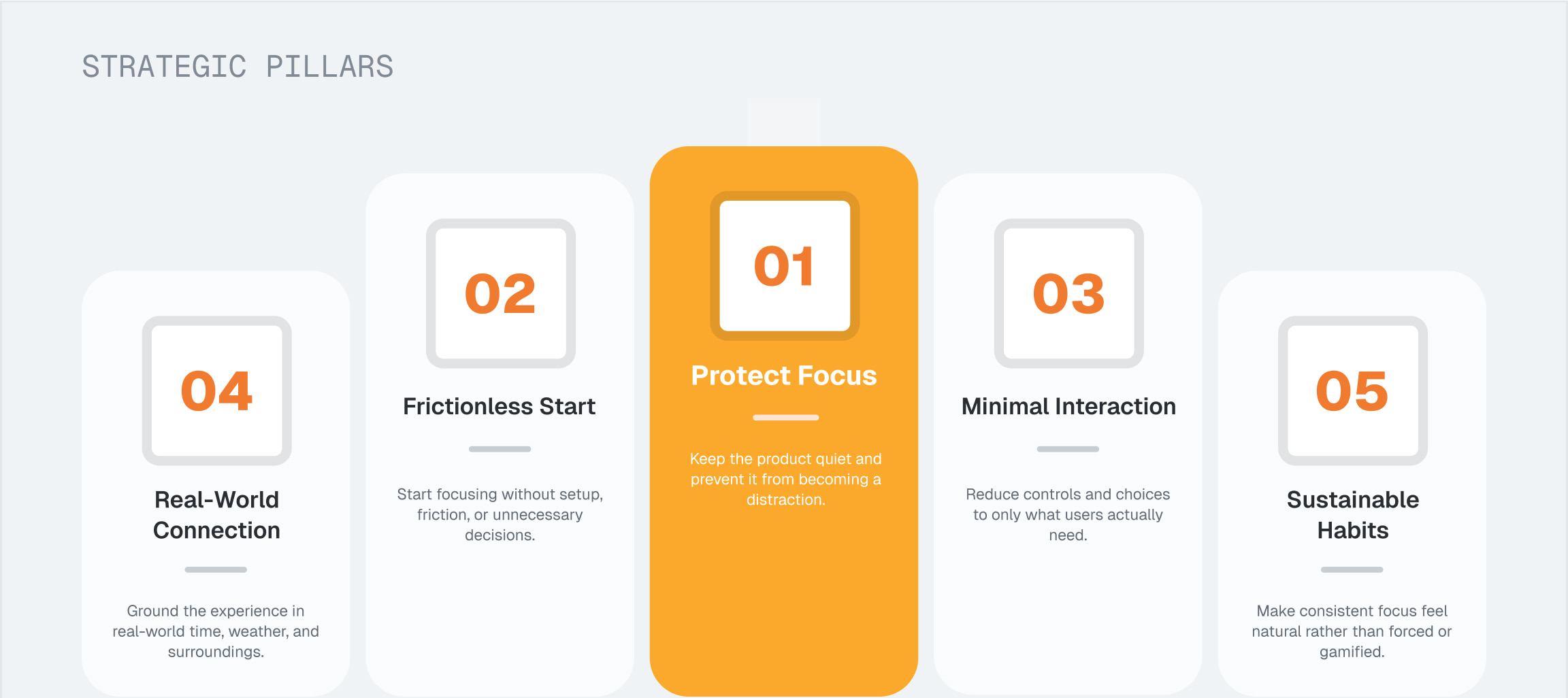
Every decision should bring users closer to focus, never further from it.
Exploring the Experience
Designing the experience before designing the interface
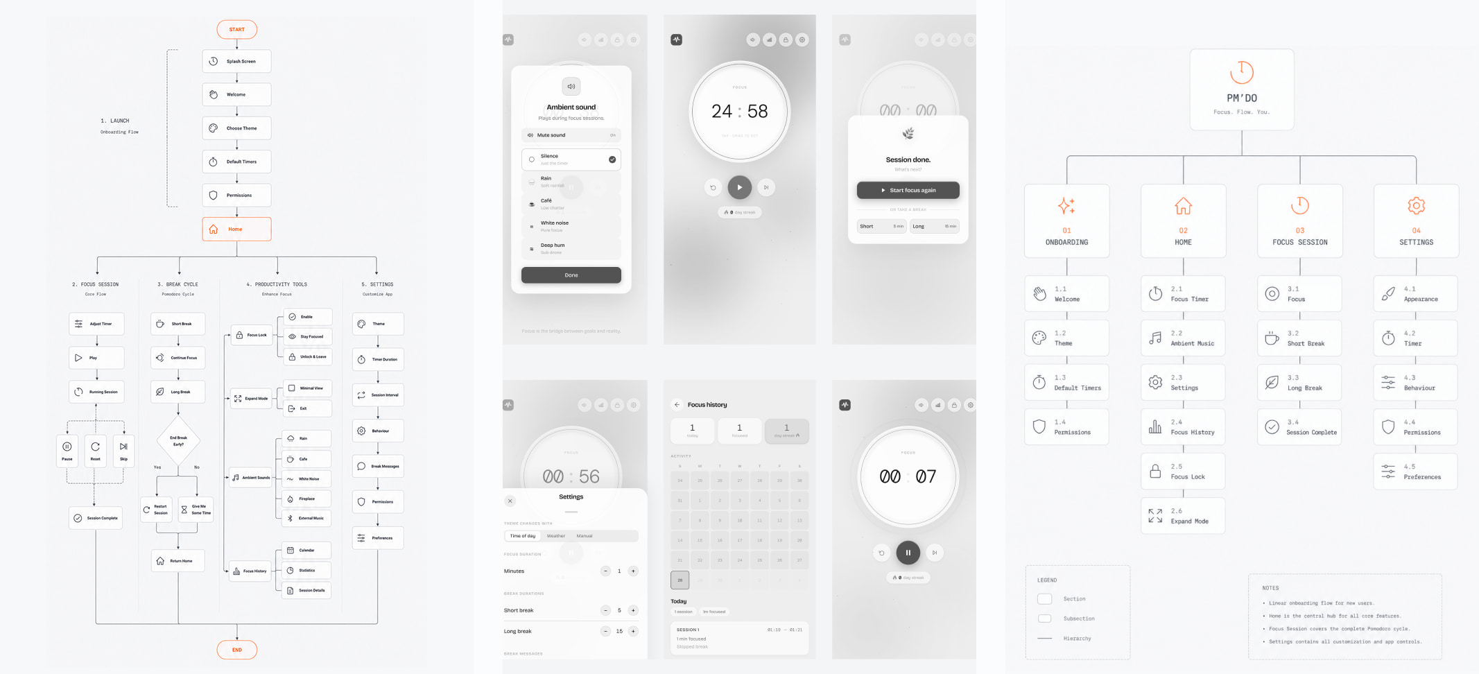
With a clear product direction in place, I shifted my focus to the experience itself. Instead of jumping straight into polished screens, I explored information architecture, user flows, navigation patterns, and interaction models to identify the shortest path from opening the app to focus.
With the product direction clear, I explored information architecture, user flows, navigation, and interaction patterns before moving to polished screens.
Prototyping and Testing
Designing through interaction, not static screens
Prototyping helped validate ideas early, uncover friction, and iterate before development.
From intent to focus
A frictionless path from opening the app to starting a focus session, eliminating unnecessary decisions.
Staying in the zone
Ambient visuals, audio, and Expand Mode work together to minimize distraction without overwhelming the user.
A sustainable focus loop
From session completion to breaks and history, every interaction supports consistency and makes returning to focus effortless.
Trade-offs & Decisions
Decision 01: Reducing the time to focus
Multiple screens & setup
 Multiple screens & setup
Giving users more control upfront meant more navigation, more choices, and a slower path to starting a session.
More upfront control meant more navigation, choices, and friction before starting a session.
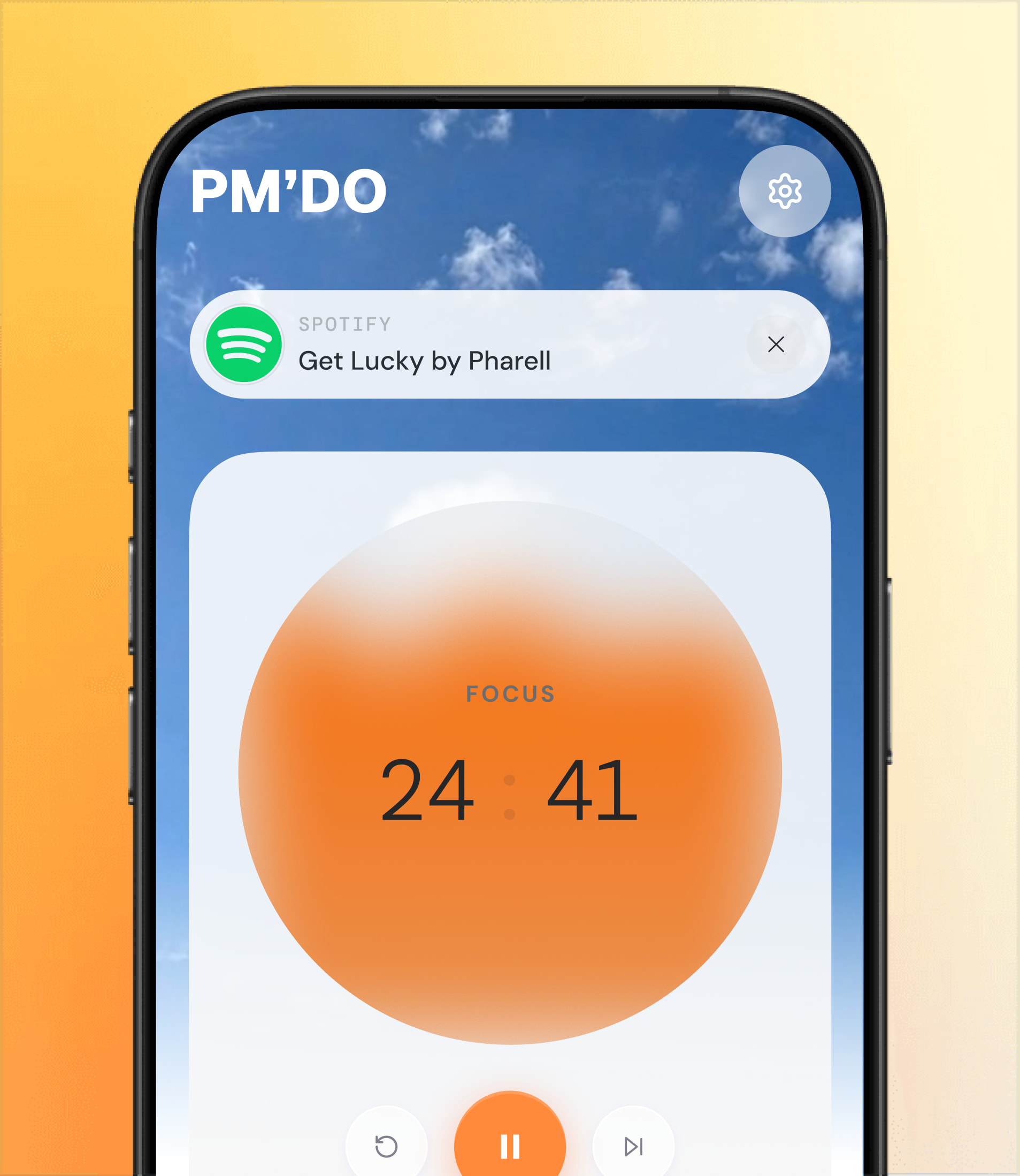
One workspace, ready to begin
One workspace with sensible defaults reduces friction before focus begins.
Decision 02: Bringing the outside world into focus
Artificial digital environments
Animated gradients and abstract visuals looked beautiful but often felt detached from the user's surroundings.
Abstract visuals looked beautiful but felt detached from the user's surroundings.
Real environments that evolve
Time and weather-aware backgrounds create a familiar atmosphere that changes throughout the day, helping users stay grounded.
Decision 03: Designing a timer people can feel
A timer that only measures time
Traditional countdowns communicate progress but rarely influence how time is experienced.
Traditional countdowns show progress but rarely change how time feels.
A timer that visualizes time
The liquid timer makes passing time tangible, making long focus sessions feel more intuitive.
Decision 04: Keeping customization out of the way
Settings before action
Surfacing every preference upfront increases cognitive load before users even begin working.
Surfacing every preference upfront increases cognitive load before work begins.
Customization when it's needed
Advanced controls stay accessible without dominating the interface, keeping the core experience lightweight and distraction-free.
Decision 05: Building habits without pressure
Gamified productivity
Streaks, badges, and rewards encourage consistency but often shift attention toward maintaining numbers instead of doing meaningful work.
Streaks, badges, and rewards can shift attention toward maintaining numbers instead of meaningful work.
Gentle guidance over pressure
Focus Lock, session history, and flexible routines support consistency while keeping users in control.
Visual Identity
Extending the product beyond the interface
The experience begins before users open the app. PM'DO's icon carries the same principles: simple, calm, and instantly recognizable.
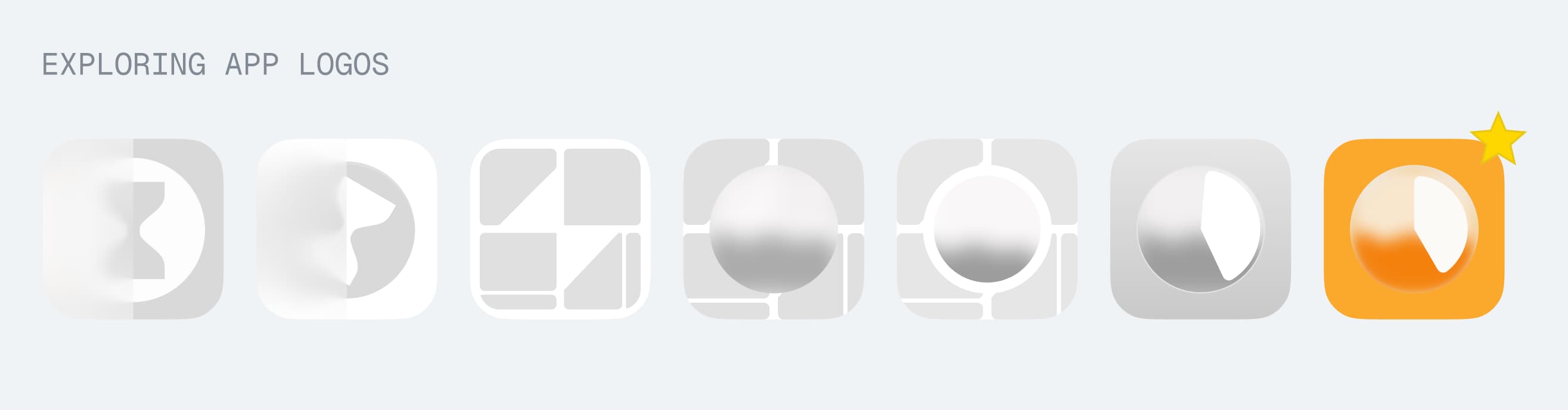
The same philosophy, distilled into a single symbol.
Design → Code
Turning polished designs into a working product
PM'DO started as a design project, but I wanted to experience what it takes to bring a product to life. Without prior Android development experience, I explored a workflow that balanced speed, flexibility, and native capabilities, allowing me to ship a functional Android application while staying focused on product design rather than platform-specific development.
PM'DO started as a design project, but I wanted to bring it to life. Without prior Android development experience, I explored a workflow that balanced speed, flexibility, and native capabilities to ship a functional Android application.
Choosing the fastest path to a working product
Rather than learning native Android from scratch, I built the interface using web technologies before packaging it with Capacitor and Android Studio. This let me iterate quickly while still delivering a native Android experience.
Rather than learning native Android from scratch, I built the interface with web technologies, then packaged it with Capacitor and Android Studio.
Designing through implementation
Implementation became an extension of the design process. Every build uncovered small usability refinements, from interaction timing to layout adjustments, that were easier to discover in a working product than in static prototypes.
Implementation became part of the design process. Each build revealed usability refinements that static prototypes couldn't uncover.
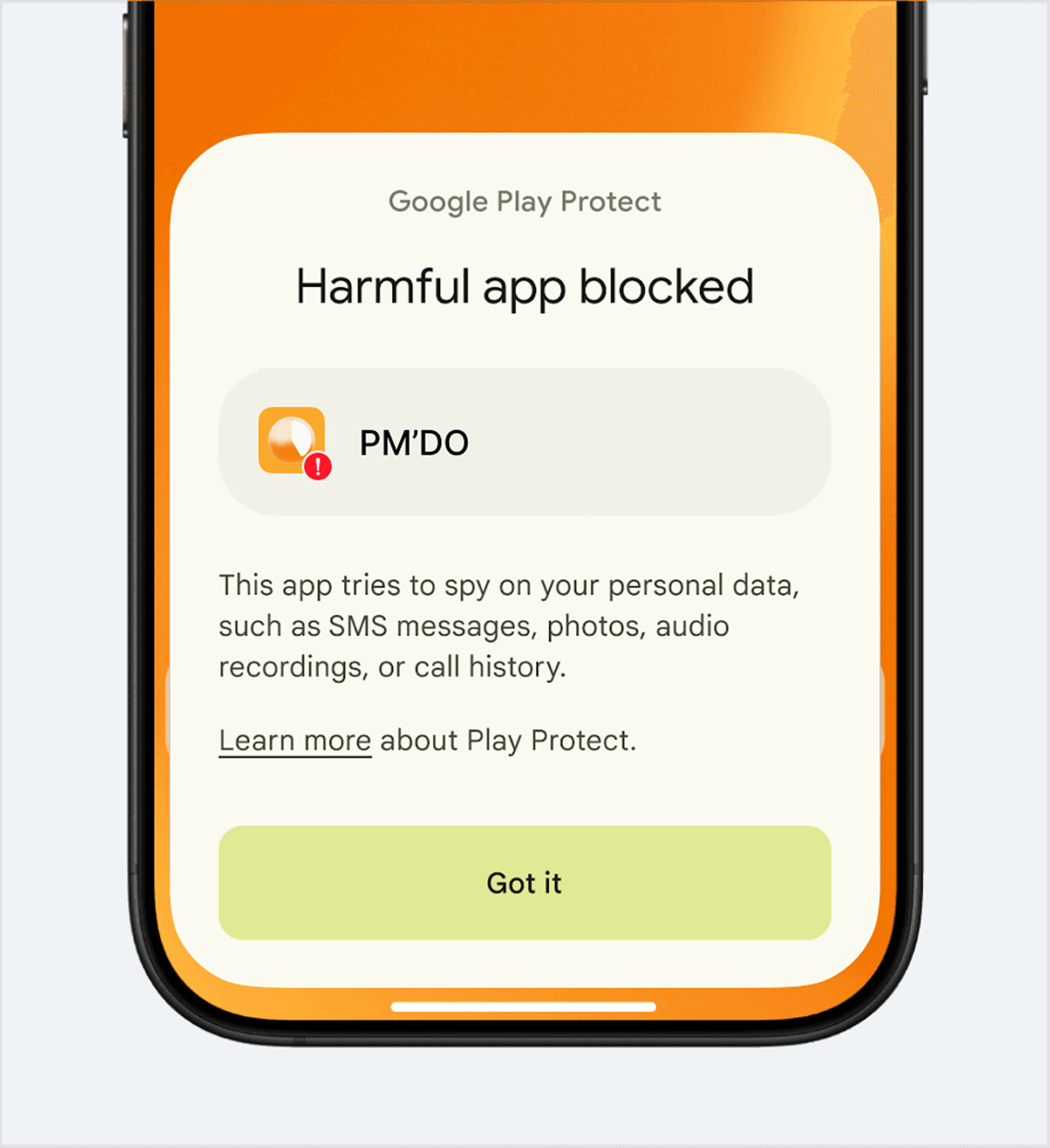
Choosing the right trade‑offs
System-level music controls required permissions that conflicted with Play Store distribution. I prioritized the richer focus experience for the beta release while identifying alternative implementation strategies for a future public launch.
System-level music controls required permissions that conflicted with Play Store distribution. I prioritized the richer beta experience while exploring alternatives for a future public launch.
Beta Launch
The real test begins when people use it
Once the core experience was complete, I shared PM'DO with a small group of early users to observe how the product performed outside my own workflow. Watching people use the app revealed friction that prototypes couldn't uncover, leading to refinements before a broader release.
I shared PM'DO with a small group of early users to see how it performed outside my own workflow. Their behavior revealed friction that prototypes couldn't uncover.
Real feedback became the final design tool
"I expected another Pomodoro app, but what stood out was how little I had to think. I opened it, pressed start, and got to work almost immediately."
— Early Beta Tester
"The changing backgrounds made a bigger difference than I expected. It felt calm and natural, and I never felt disconnected from my surroundings during long focus sessions."
— Early Beta Tester
Future Scope
Where PM'DO could go next?
PM'DO was intentionally designed as a focused MVP. While the current version solves the core problem, several opportunities emerged during testing that could further strengthen the experience without compromising its guiding philosophy.
PM'DO was intentionally designed as a focused MVP. Testing revealed opportunities to strengthen the experience without compromising its guiding philosophy.
These ideas represent future directions rather than unfinished work
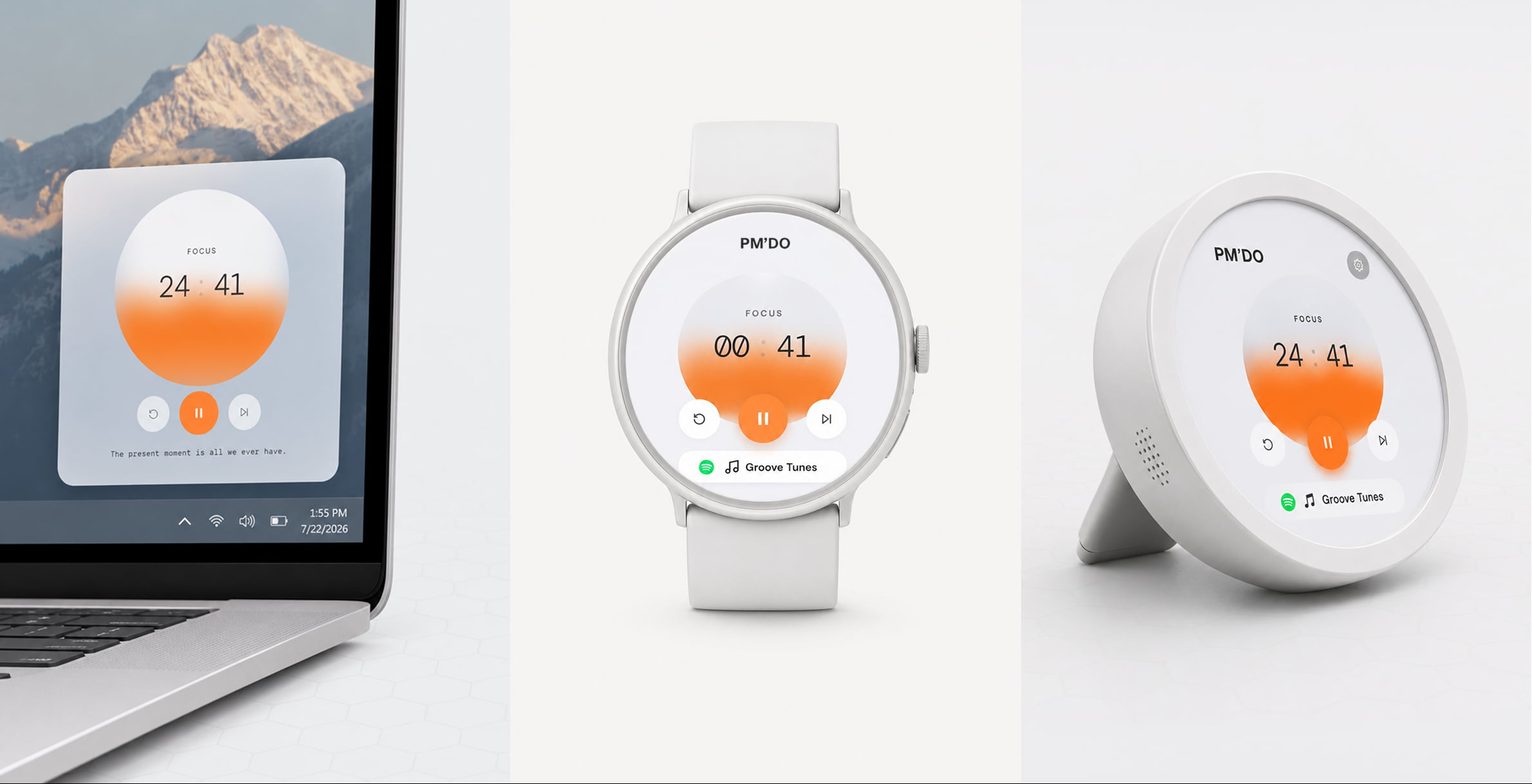
Desktop Widget
A lightweight desktop companion
Wearables
Extend sessions to smartwatches with glanceable progress
Smart routine
Learn from focus habits over time to suggest the best routine
Reflection
What building PM'DO taught me
Designing less, solving more
PM'DO reinforced that great product design isn't about adding features. It's about making deliberate decisions that remove friction and help people achieve their goals with less effort.
Great product design isn't about adding features. It's about deliberate decisions that remove friction and help people achieve their goals.
Ownership beyond the interface
This project taught me to think beyond screens and take ownership across research, strategy, prototyping, implementation, and validation.