Campus Cloud • Shipped 2026
Enterprise Dashboard Redesign for an NGO Learning Platform
The Challenge
Turning a cluttered analytics dashboard into a scalable decision-making tool
As Campus Cloud evolved, its primary analytics dashboard accumulated more reports, metrics, and navigation layers. The result was an interface that felt increasingly difficult to scan, making it harder for users to quickly find insights and make confident decisions.
The growing complexity made it harder for users to quickly understand performance and confidently act on insights.
These usability issues became the foundation for every design decision that followed.
The Transformation
A modern analytics experience, built for clarity, scalability, and faster decision-making
The redesign focused on more than visual polish. Every layout, component, and interaction was rethought to reduce cognitive load, improve data readability, and create a scalable analytics system. The result became the foundation for five additional dashboard redesigns across the platform.
Key Highlights
1. Clearer Information Flow
Important insights are easier to find and scan.
2. Consistent Design Language
Established consistent patterns across future dashboards.
3. Better Decision Support
Designed to support growing datasets without sacrificing usability.
The Approach
Every design decision started with a simple question: how can users understand complex data faster?
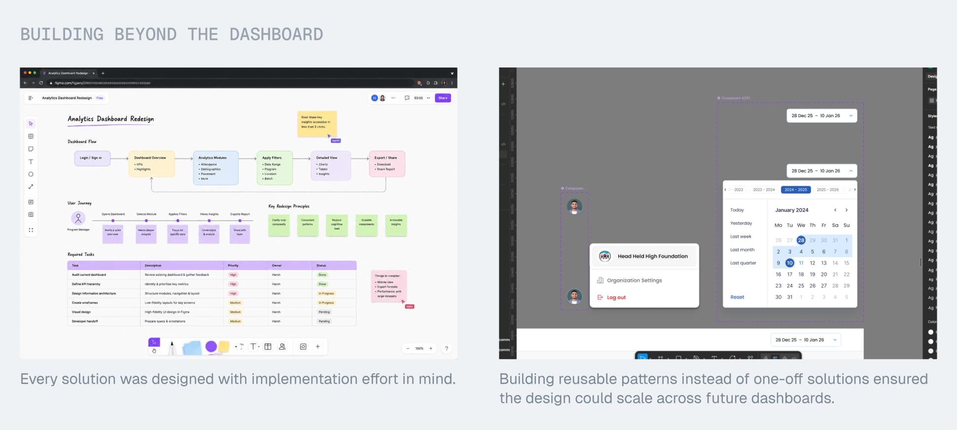
Rather than redesigning screens component by component, I approached the dashboard as a connected analytics system. Every decision was guided by improving information hierarchy, reducing cognitive load, and creating reusable patterns that could scale across future dashboards.
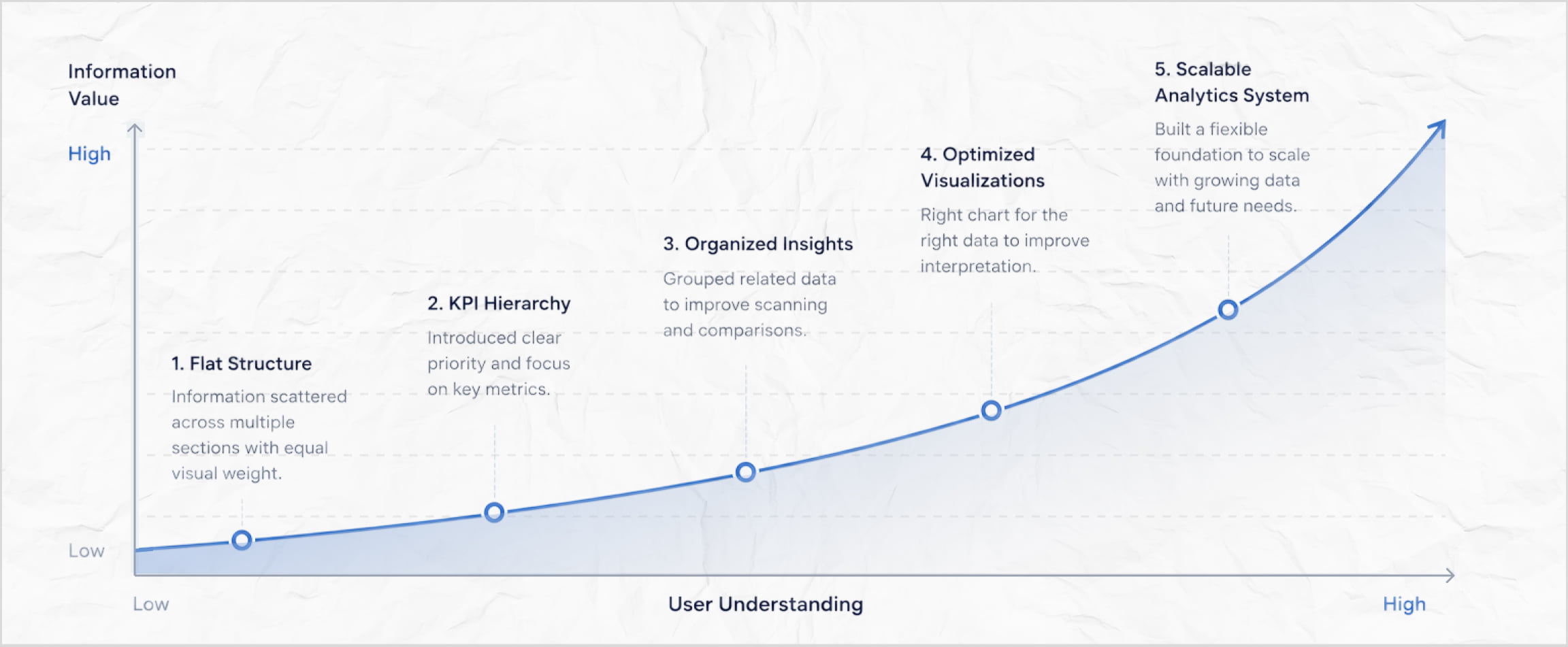
Information Architecture Evolution
Reorganized content to guide users from high-level metrics to detailed insights.
Design Principles
Five principles guided every design decision throughout the redesign.
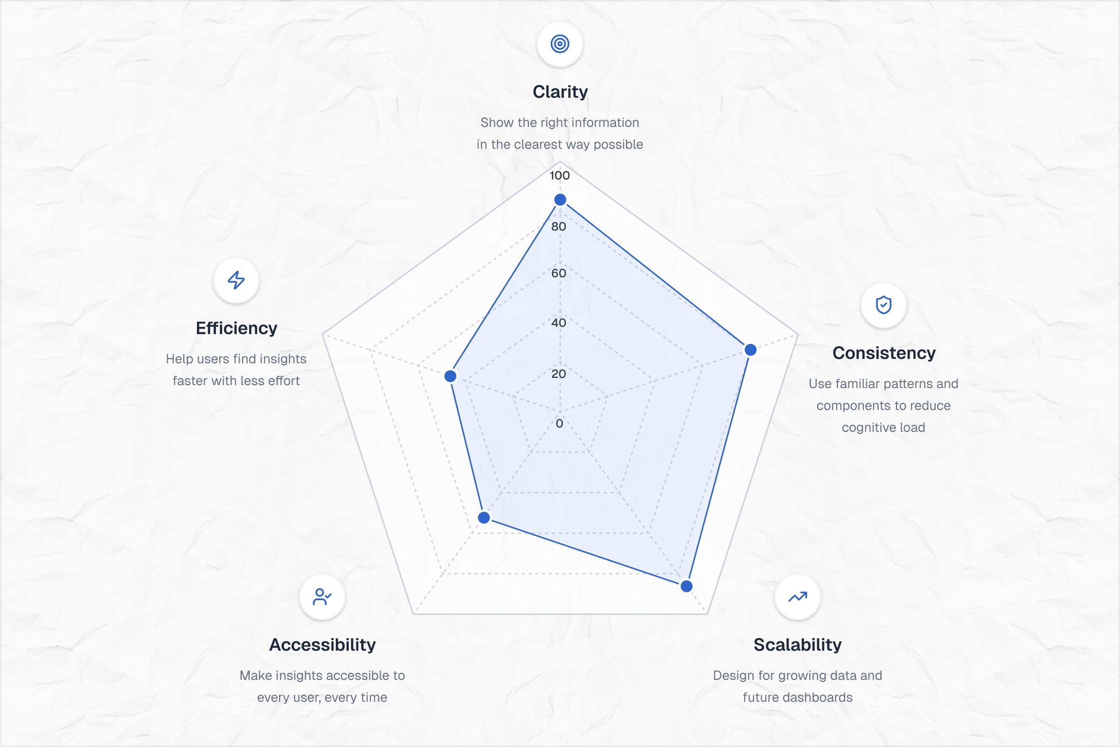
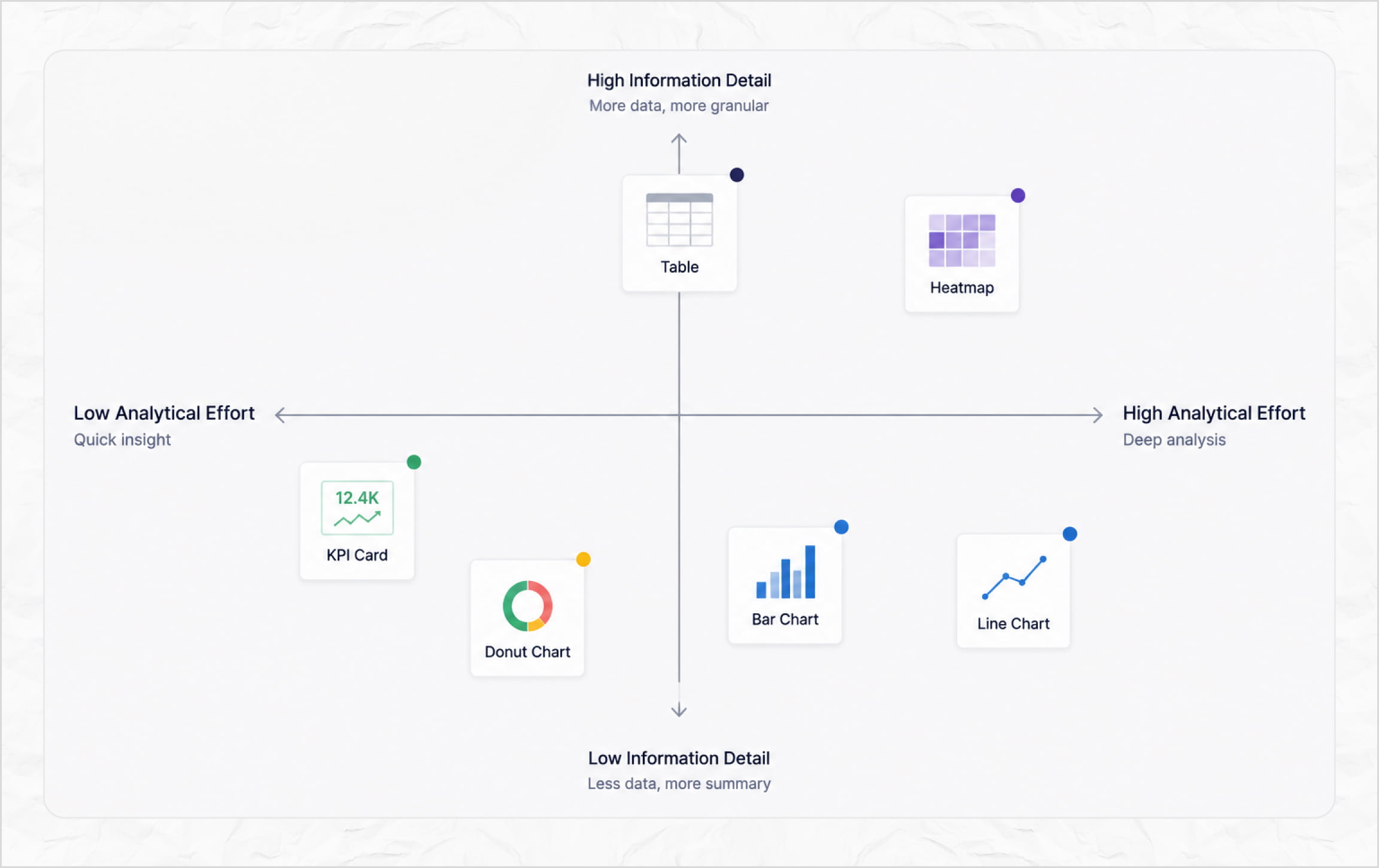
Chart Selection Framework
Every visualization was chosen based on the type of insight users needed to uncover.
Key Design Insights
1. Related Metrics Were Scattered
Related analytics were distributed across multiple sections, making it difficult to connect information and build a complete understanding of performance.
2. Inconsistent Data Visualization
Similar datasets were represented using different chart types, increasing cognitive effort and making analytics harder to compare at a glance.
Key Design Highlights
Breaking down the decisions that shaped the final experience
Rather than redesigning individual screens, I focused on improving how users discovered, interpreted, and acted on information. Every change was designed to reduce cognitive load while making analytics faster to understand.
Designing for Faster Information Discovery
The dashboard was restructured to surface the most important metrics first, creating a clear visual hierarchy that helps users quickly understand overall performance.
Simplifying Navigation
Navigation was streamlined to improve discoverability and establish predictable access to analytics, reducing the effort required to move between reports.
Data Visualization
Choosing the Right Chart for Every Question
Every visualization was selected based on the insight it needed to communicate, ensuring trends, comparisons, and distributions could be understood with minimal cognitive effort.
Filtering Without Friction
Filters were redesigned to support faster data exploration while keeping the interface lightweight, helping users refine information without interrupting their workflow.
Building a Reusable Visual Language
A consistent component system unified layouts, typography, colors, and interactions, creating a scalable foundation for future analytics dashboards.
Data Tables
Balancing Detail with Readability
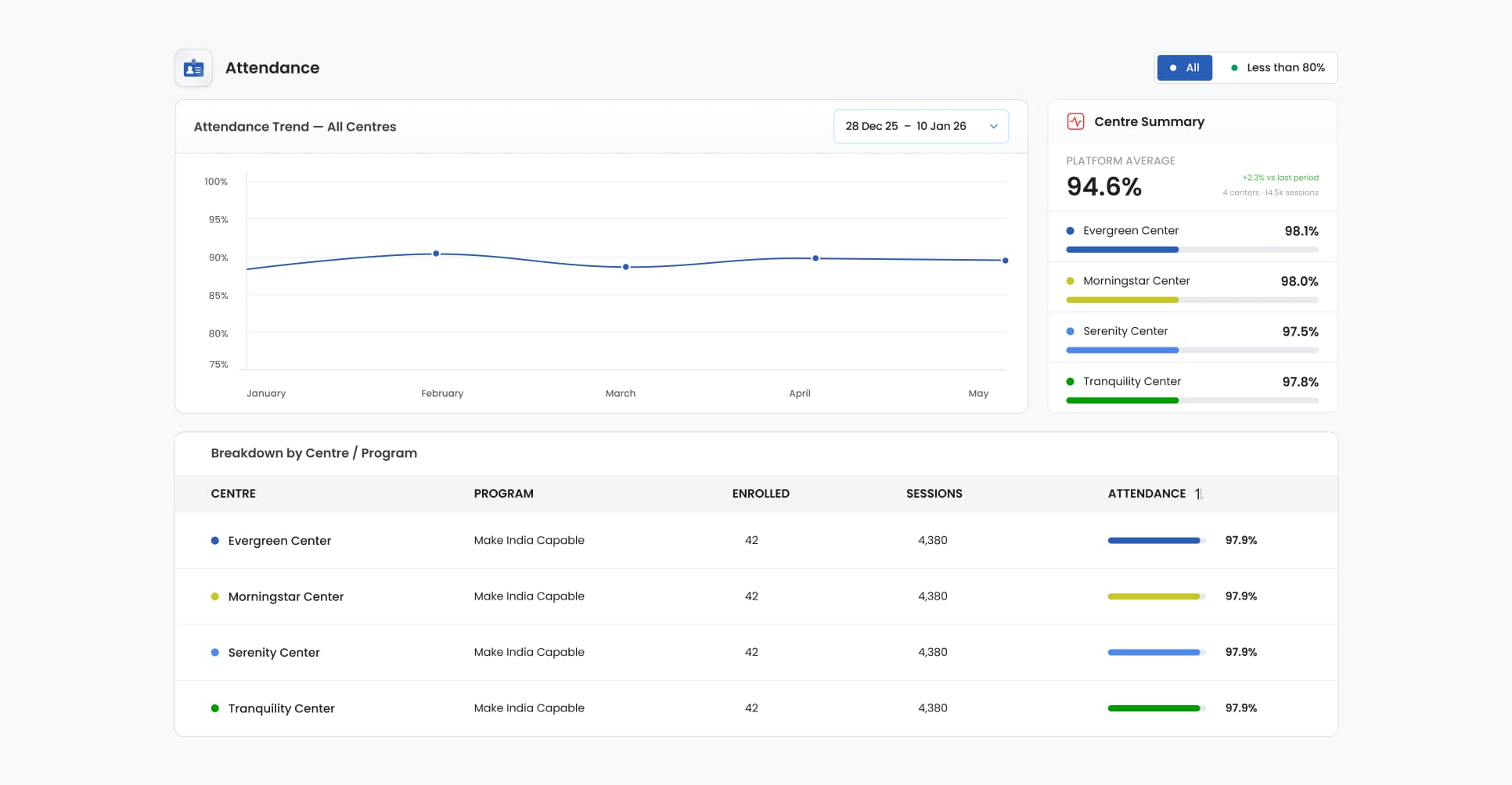
Dense tables were reorganized using improved spacing, alignment, and hierarchy, making large datasets easier to scan without sacrificing valuable information.
Trade-offs & Constraints
Designing within real-world constraints, not ideal conditions
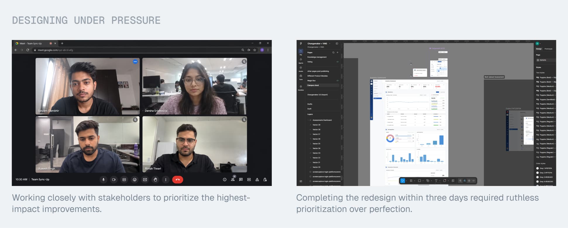
Every decision was shaped by practical constraints, from tight timelines to existing technical limitations. Instead of aiming for perfection, the focus was on delivering the highest-impact improvements that could be implemented efficiently and scaled over time.
The Impact
One redesign that shaped the future of analytics across the platform
Foundation for 5 Additional Dashboards
The design language established in this redesign became the foundation for five additional analytics dashboards across the platform.
Established a Reusable Analytics System
Introduced consistent patterns for layouts, components, and data visualizations, reducing design effort for future analytics experiences.
Improved Analytics Readability
A clearer information hierarchy and purposeful data visualization made complex analytics easier to scan, interpret, and act upon.
Project Feedback
"The new dashboard provides a much clearer overview of program performance and gives us a scalable direction for future analytics."
— Stakeholder
"Finding the information I need now feels much more intuitive. The dashboard is easier to scan, and important insights stand out without feeling overwhelming."
— Client
Reflection
What this project taught me
Clarity Over Complexity
I learned that the value of an analytics dashboard comes from helping users understand information quickly, not from showing more data.
Systems Over Screens
This project strengthened my ability to balance user needs, business goals, and technical constraints while designing solutions that extend beyond a single interface.